Nov 19, 2025
How to Design a Business Card
Step by Step Tutorial

How to Design Business Cards in Figma: A Step-by-Step Tutorial
I used to design my business cards in Photoshop, but they always felt a little off. I've found Figma to be an overall much easier tool for creating graphic designs that gives me better results that I actually understand.
If you've never used Figma, I'll try to cover some of the basics, but you might need some additional tutorials if you really want to level up your graphic design skills!
Step 1: Creating the Base
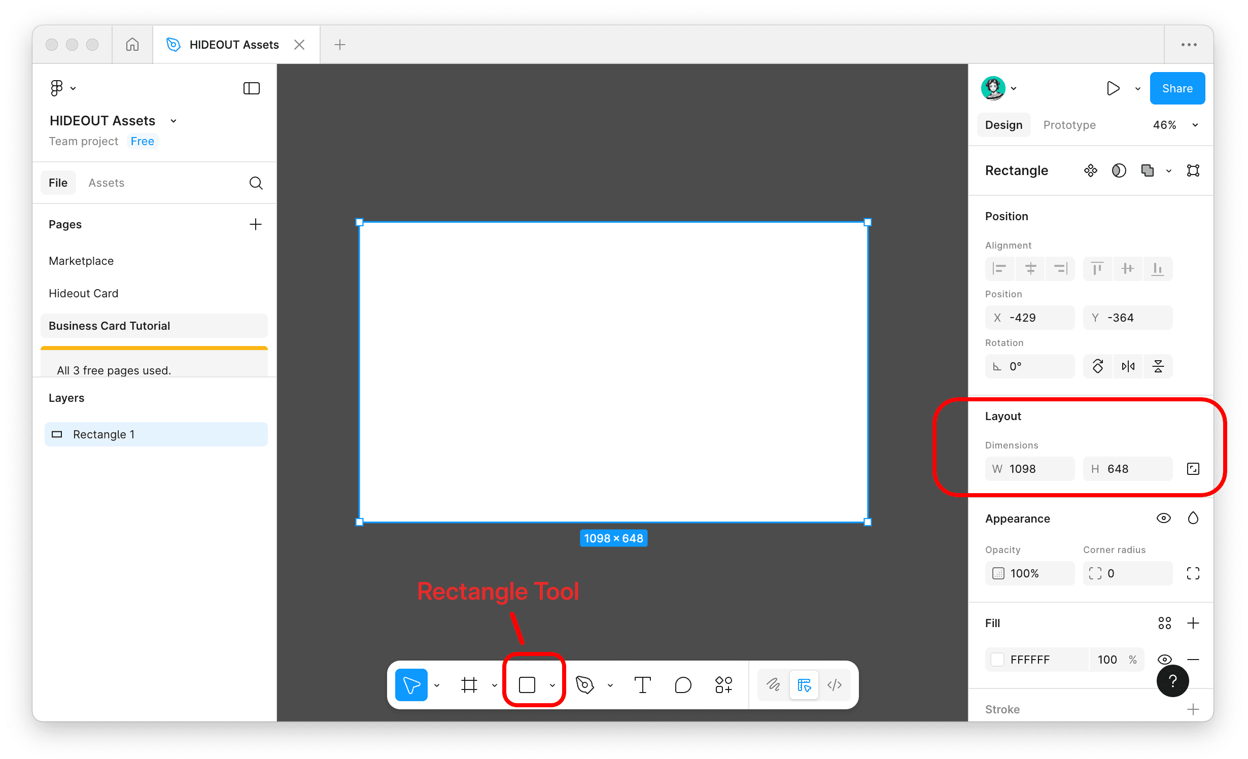
Let's start by creating the base of our business card using the measurements of 1098px width x 648px height. To do this, select the Rectangle tool (R) and drag it onto your canvas. You'll see a 'Rectangle 1' appear in your layers panel on the left.
Step 2: Convert to a Frame
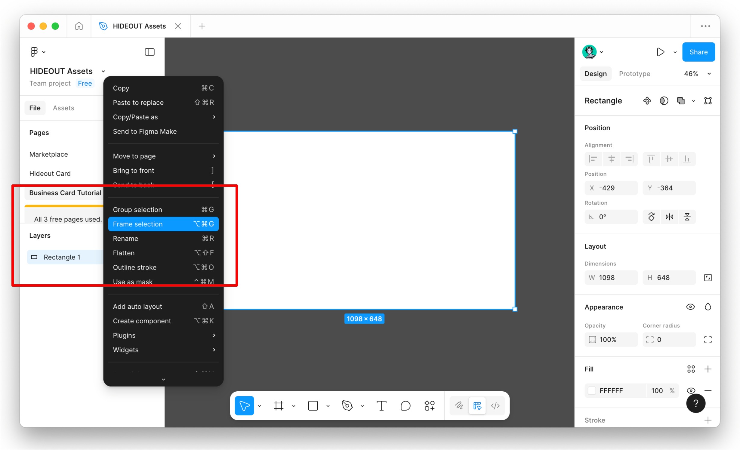
Now you'll want to convert this rectangle into a frame. Right-click on your rectangle and select "Frame Selection". This will allow you to start creating padding, which is basically how we'll grid out your design and keep everything organized.
Step 3: Adding Autolayout
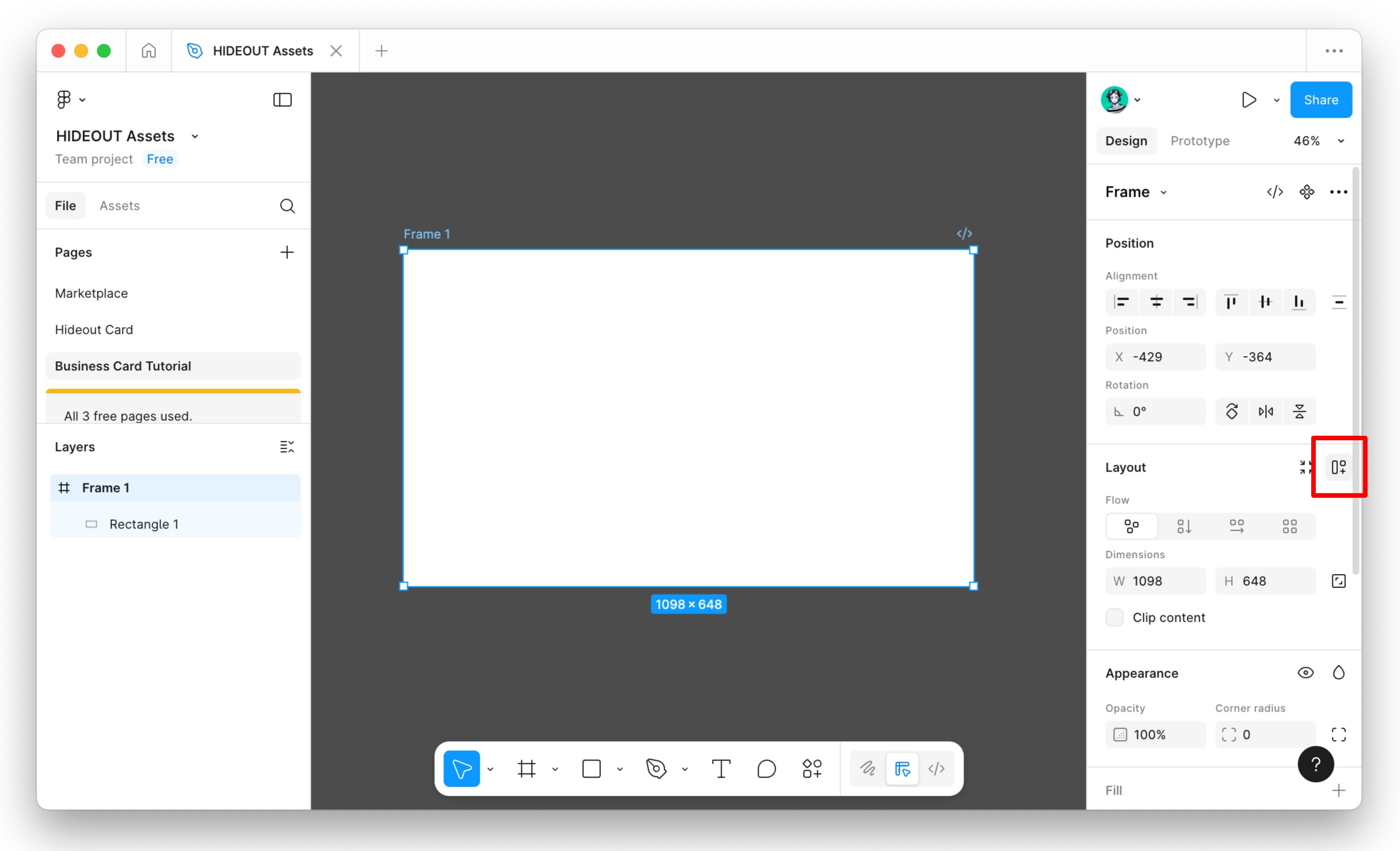
This is where the magic happens, but it may take some time to get used to and master. With your frame selected, click on the Autolayout button).
A new options menu will appear on the right side.
Before we continue, let's fill the frame with any color you like using the fill option on the right 'Appearance' panel. This helps us see what we're working with.
Step 4: Setting Up Autolayout Options
Once you have your autolayout applied, you might not notice much at first- that's normal! Here's where we configure it:
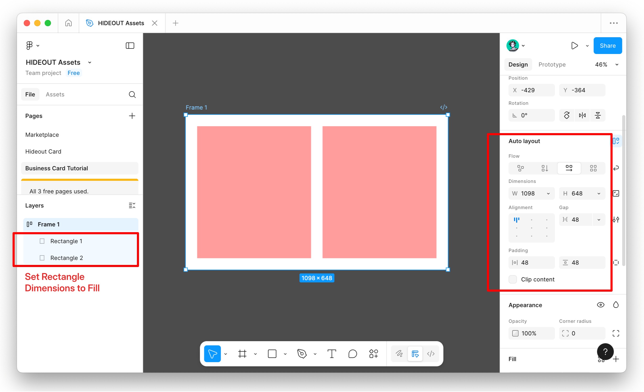
Click on your rectangle layer inside the frame
Set its dimensions to "Fill" for both width and height (you'll see this option in the right panel)
Duplicate your rectangle so that you have two rectangles within your frame (Cmd/Ctrl + D)
Now select the outer frame and adjust the gap and padding settings
For the padding, I recommend setting it to 48px on all sides. For the gap between the two rectangles, try 48px as well to start.
Pro Tip: When designing in figma try and keep your numbers consistent and in either multiples of 4's or 5's. For example 4px,8px,16px,48px etc or 5px,10px,20px etc. By doing this, you're maintaining a consistent grid that will make your work look professional.
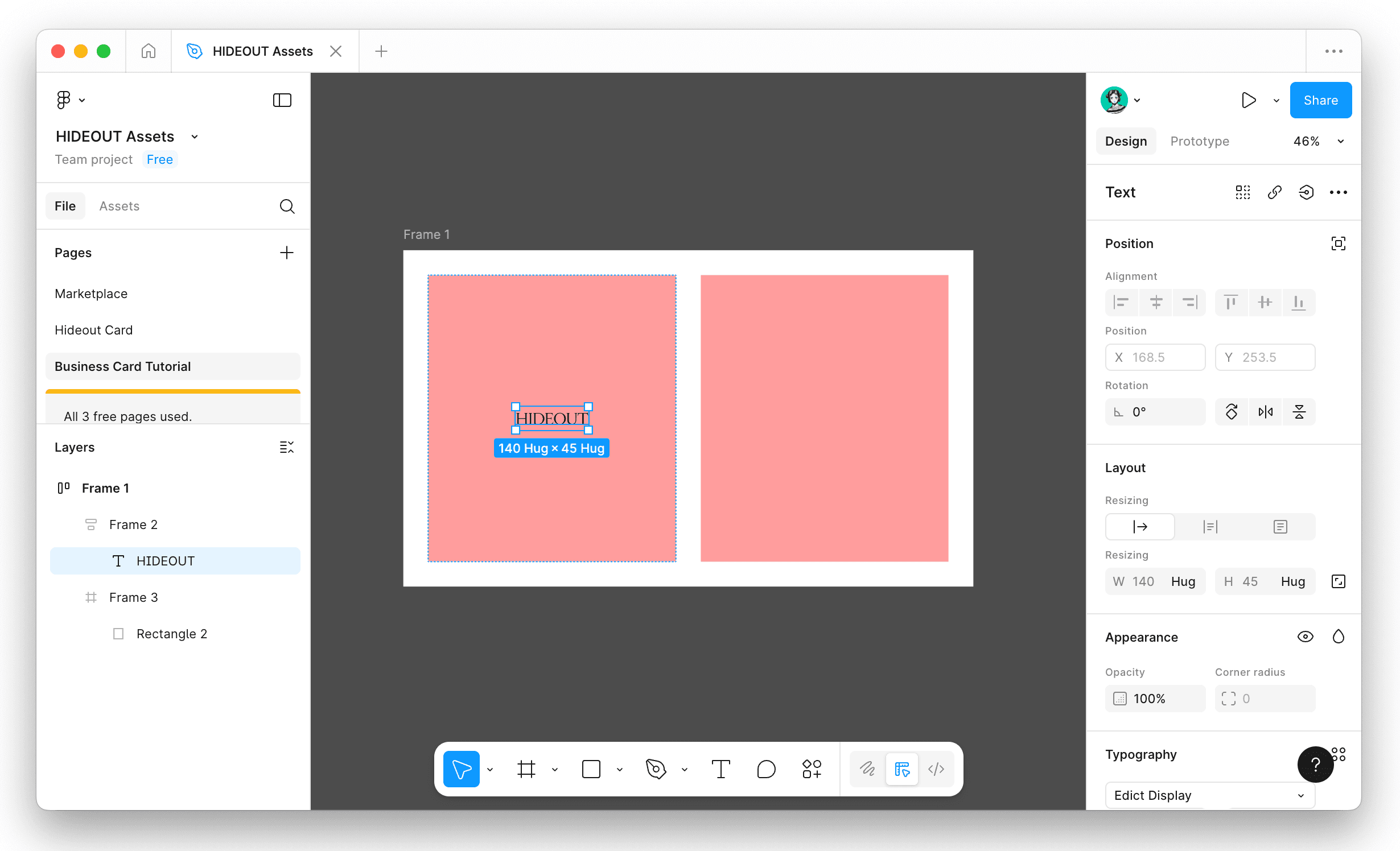
Step 5: Adding Text Frames
Now we want to repeat the framing process for both rectangles inside our base so we can convert them to frames and create autolayout containers to align our text properly.Select one of your rectangles
1.Right-click and choose "Frame Selection"
2. You'll notice the original rectangle is still within the frame—you can delete this rectangle. We only need the frame itself.
3.Add a text layer (press T) inside this frame
4.With the text selected, I recommend setting its resizing to "Hug" (for both width and height). This makes the bounding box fit nicely around the text when we use autolayout placements.
Step 6: Text Alignment and Positioning
Repeat Step 5 on the other rectangle so both boxes have text frames set up.
Now that you have your two frames configured, you can remove any fill colors within your frames and start playing around with autolayout placement. This is where things get fun!
Select one of your frames and make sure:
Autolayout is enabled
The frame's resizing is set to "Fill"
You'll notice on the right panel there's an alignment selection beside the Gap setting. Since your text is set to "Hug," you can now move it around within the autolayout using these alignment buttons (top, center, bottom, left, right).
This is crucial for good graphic design because we're ensuring that your text stays aligned to the initial padding grid we set up. Everything stays organized and professional-looking.
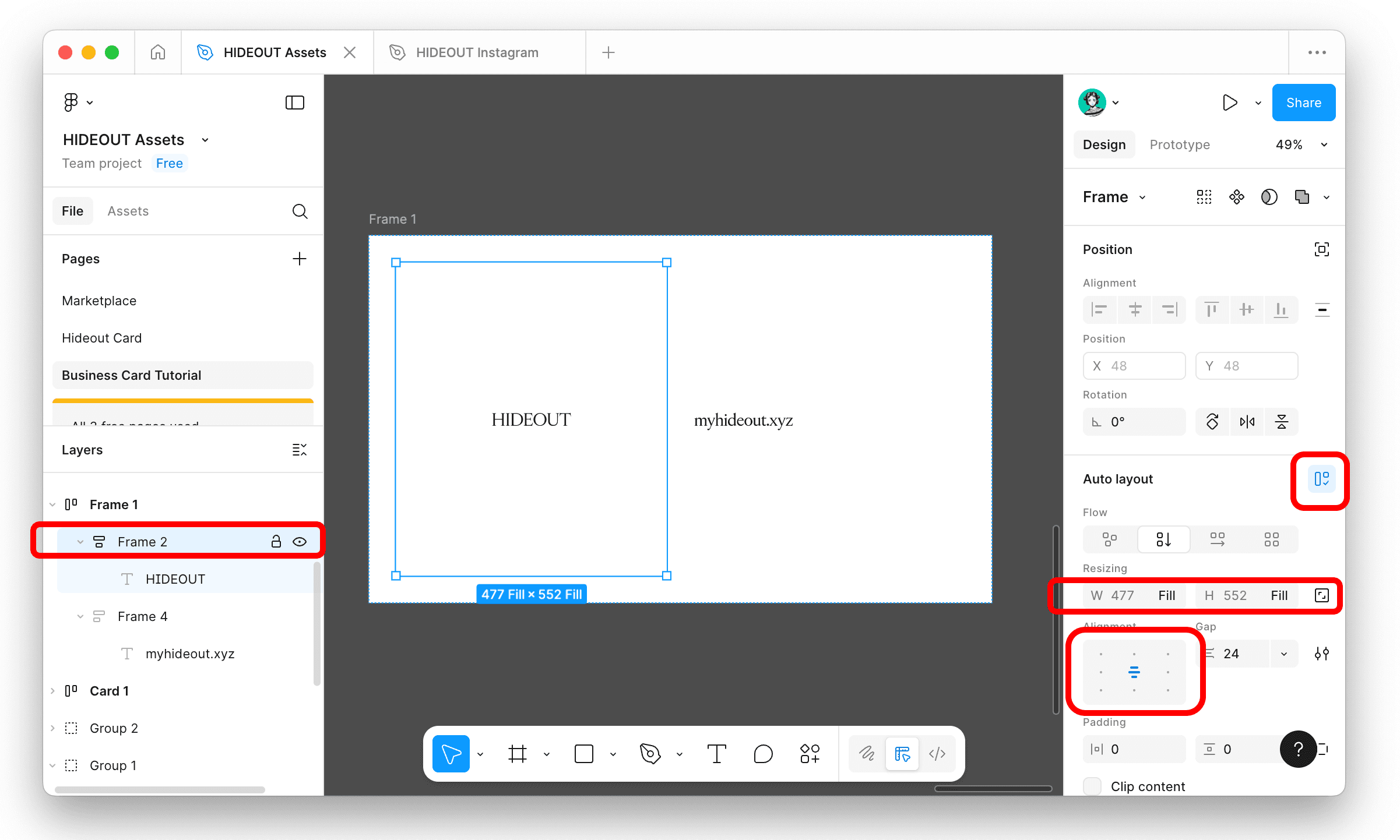
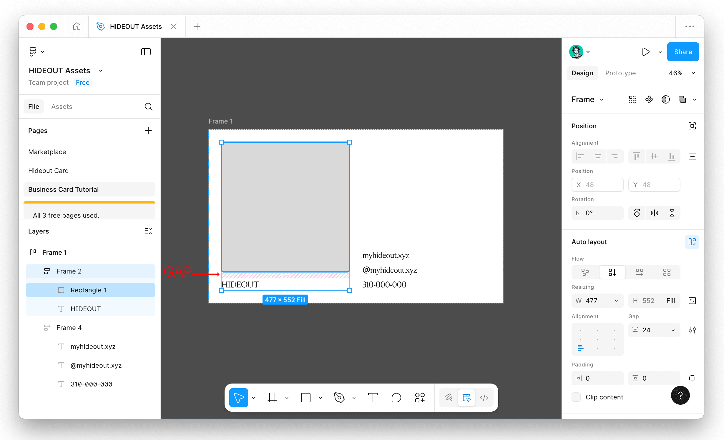
Step 7: Creating Layouts
Once you have your text aligned the way you want, try adding some rectangles to your frames if you want to incorporate images or graphics.
When you add a rectangle:
Set its resizing to "Fill" on both width and height
To change its size while keeping it on the grid, select the enclosing frame layer
Start playing with the gap setting
Remember, we want to stay in multiples of 4 for good design. I'm going to set the gap of this frame layout to 24px, that's half of my card's overall padding (48px), which keeps everything proportional.
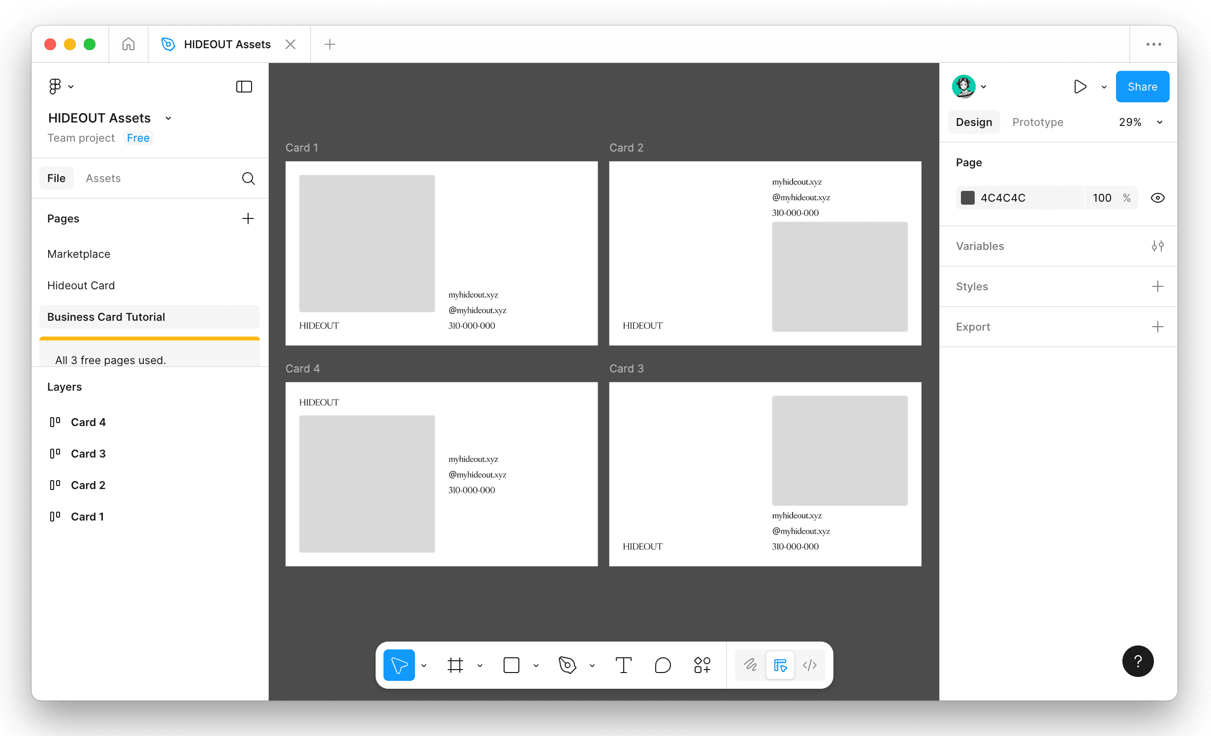
Step 8: Experiment with Variations
Once you get the hang of it, you can start making layout variations very quickly and getting more creative with your grid layouts. The beauty of autolayout is that you can rearrange elements, change gaps, and try different compositions without having to manually reposition everything.
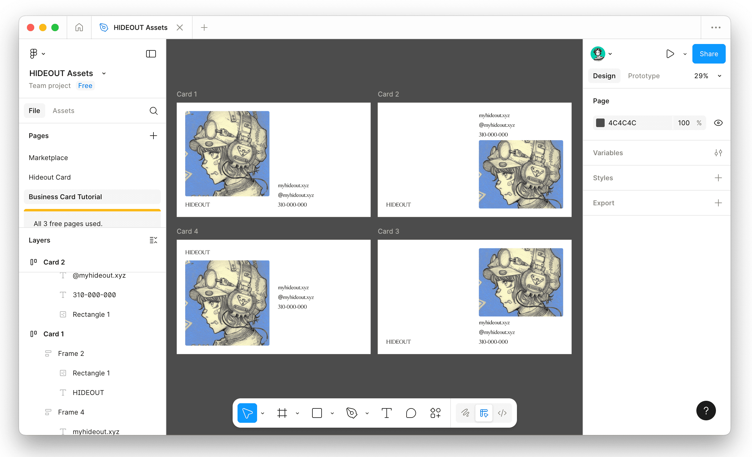
Try creating 3-4 different variations of your business card front. Mix up where the text sits, add graphic elements in different positions, and see what feels right for your brand.
Step 9: Adding Your Final Image/Graphics
Add some images or graphics to the front of your business card to finalize your look!
You can drag and drop images directly into Figma, then place them in one of your rectangle placeholders. You can also change the fill settings on the rectangles. The autolayout will keep everything aligned.
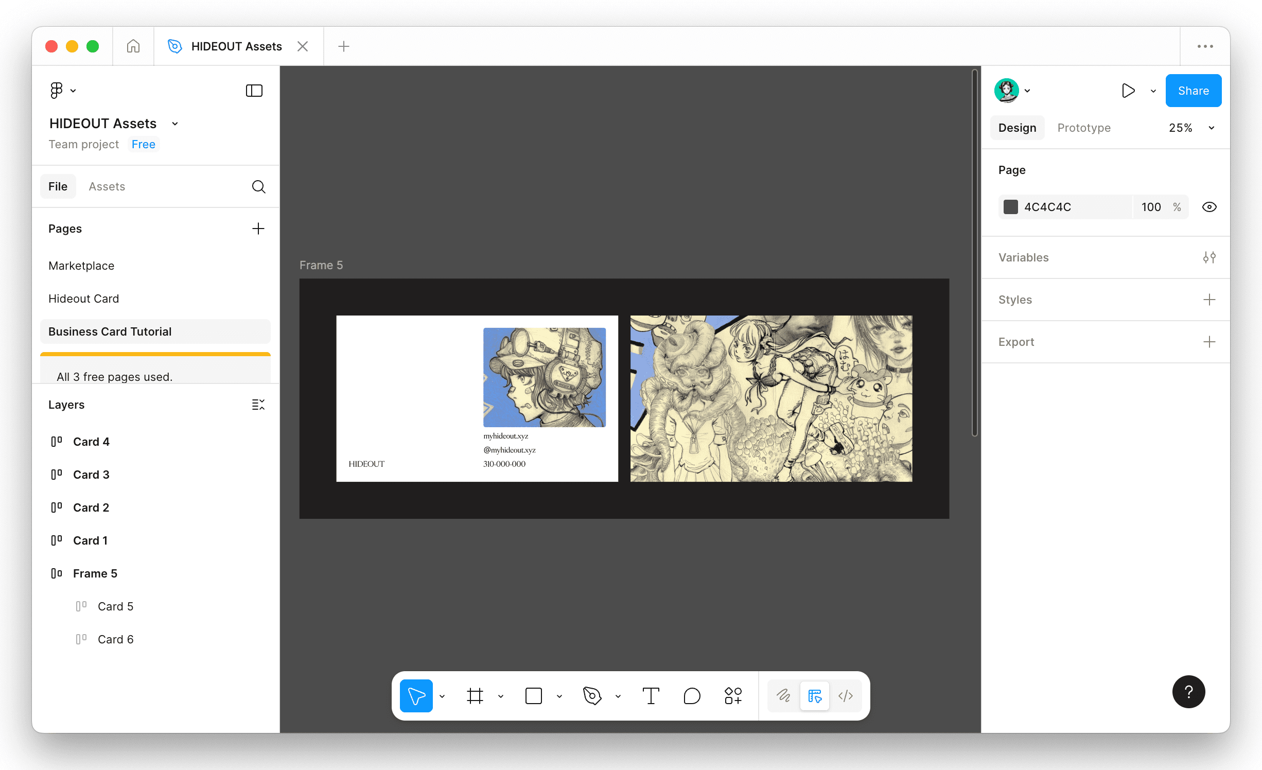
Step 10: Design the Back and You're Done! ✔️
Select your final front design, now we can move onto the back.
For this design, I'm keeping the back simple with just a single piece of art. However, feel free to repeat a similar process as the front and create whatever you wish. Some people like to add a tagline, or additional contact info on the back.
Once you're done, you can export your designs (File > Export) and get them printed out!
And that's it! You've just designed your first business card in Figma using autolayout. I know it might feel a bit overwhelming at first, especially if you're new to Figma, but once you get the hang of autolayout, you'll be using it for everything graphic design related.
If you're having trouble with any of the steps, there are tons of Figma tutorials out there that can help fill in the gaps and give you a deeper understanding of the tools.
If you found this helpful, try experimenting with different layouts and color schemes. The more you play around with it, the more natural it becomes. Happy designing!