Oct 25, 2025
Digital Mock Ups for Traditional Drawings
How I use Procreate to digitally plan out my piece before jumping into traditional work.

Hey guys, today I want to share a step-by-step tutorial on how I digitally mock up pieces before taking them into traditional mediums. I'll be covering what kind of information I need before beginning a piece, how I start my sketches, and how I map out lighting from imagination.
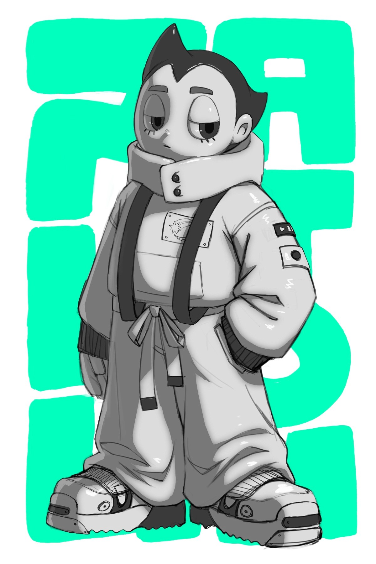
This piece is going to be for a traditional graphite drawing I'm doing for a show at Designer Con this year! D-Con is an annual convention held in Las Vegas showcasing collectible toys, plush, customs, designer apparel, and urban and underground art. Because this convention is focused on collectibles, I wanted to pay tribute to an iconic character with a rich history, Astroboy. I'm planning on doing a rendered graphite drawing of Astroboy with a simple background design with text.
In the initial brainstorming stage of every piece, I try to imagine what the final piece will look like so I can figure out what I need in the first stages to help me achieve the final result. Recently, I've been using Procreate a lot for mocking up my traditional pieces because it gives me a lot of freedom to explore and figure things out before jumping into the final traditional piece.
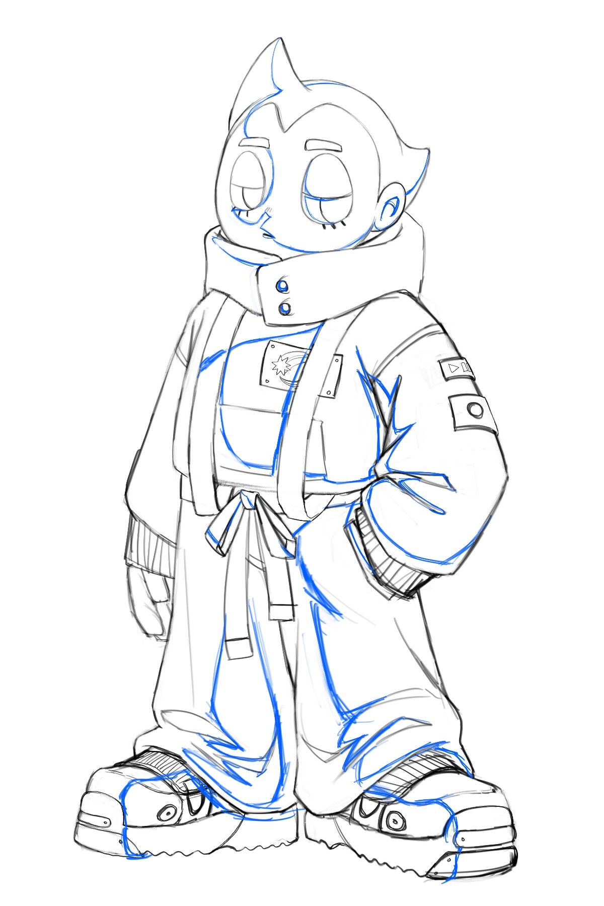
Rough Sketch
With a vague idea for Astroboy in my head, I first did some research on old Astroboy toys and then started to roughly sketch out a nice gesture for the character while taking some creative liberties with the design. I wanted to make a modern version of the character, so I put a lot of thought into the fashion choices for him. I love an A-line silhouette, so I made the clothes droop down to the chunky shoes. I start with very rough, broad lines and slowly define details as I figure out the pose and design.
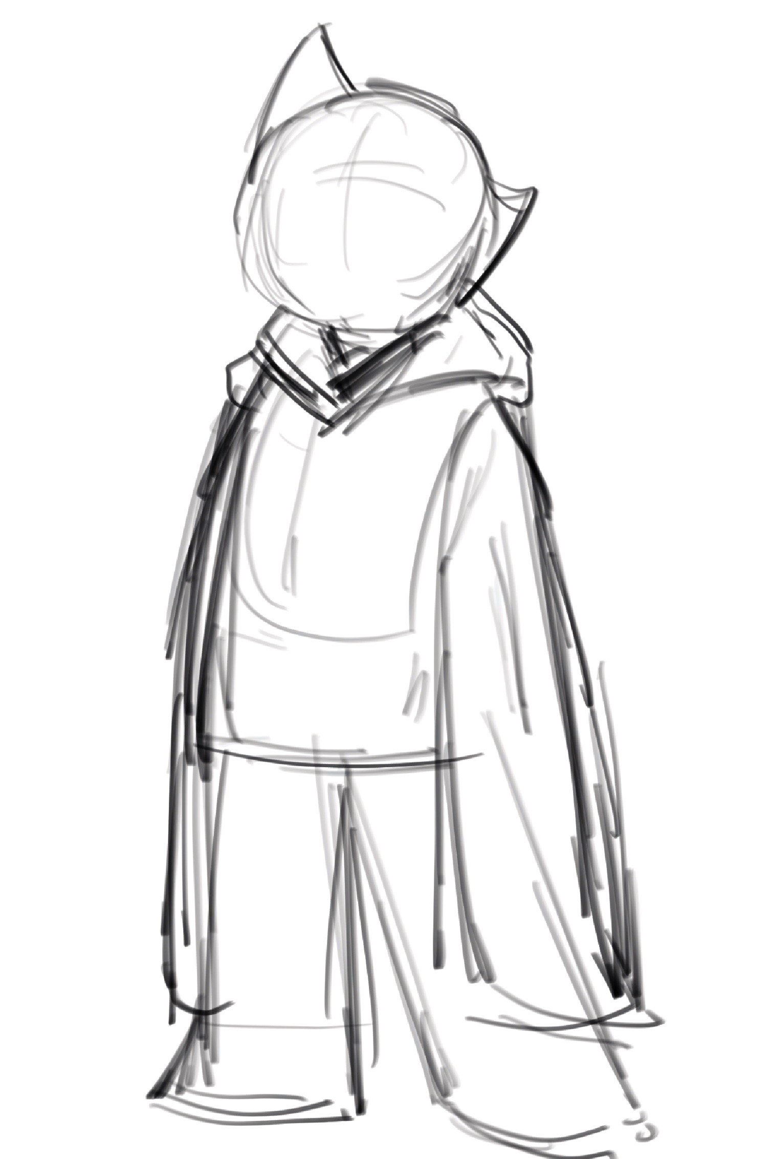
I tend to do the rough sketch on one layer and go back and forth erasing and drawing until I carve out nice shapes and lines. I also try to capture the expression for the character early on so the whole pose can reflect the emotion. It's common to see Astroboy with a playful or determined expression, so I wanted to try making a nonchalant version in a relaxed pose. I was referencing a lot of existing toys, so I was also trying to imagine how this sketch would work as a physical toy.
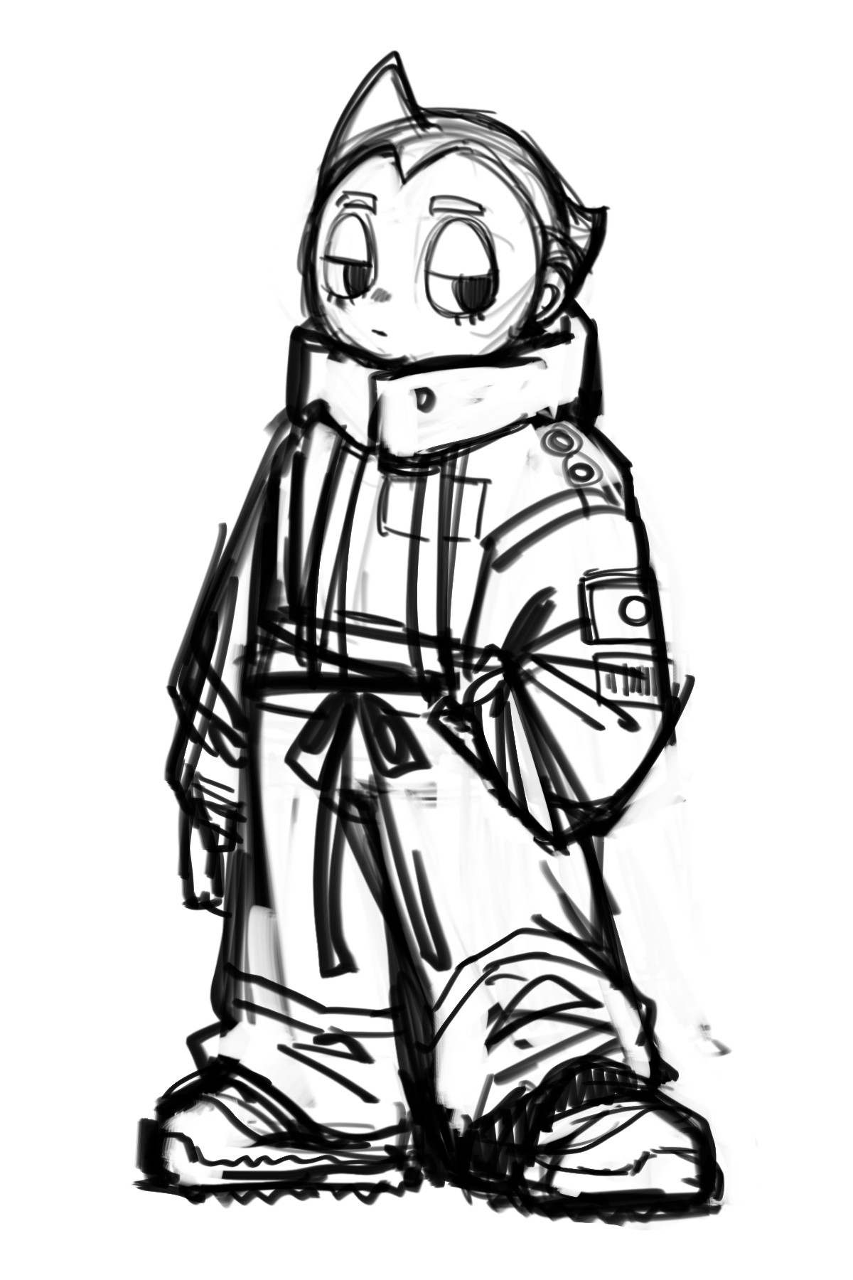
Cleaning up the Linework
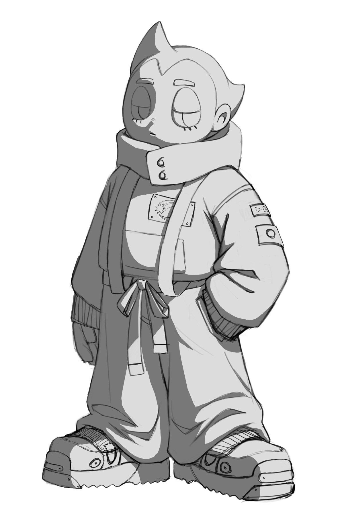
Once I'm pretty happy with the gesture of the rough sketch, I lower the opacity of this layer and add a new layer on top where I do my final linework. I want the lines on this layer to be very precise because I'll be using this drawing to trace my sketch onto the final physical paper. I make sure to figure out all of the details during this stage so I'm not confused about anything when I start on the final piece.
Once I'm happy with the final linework, I turn off the sketch layer to make sure everything is looking solid. I double check that I understand how every part of this drawing is structured like how each part of the clothing is folding or creasing into each other, so I can imagine this character in a 3D space and light it properly in the next step.
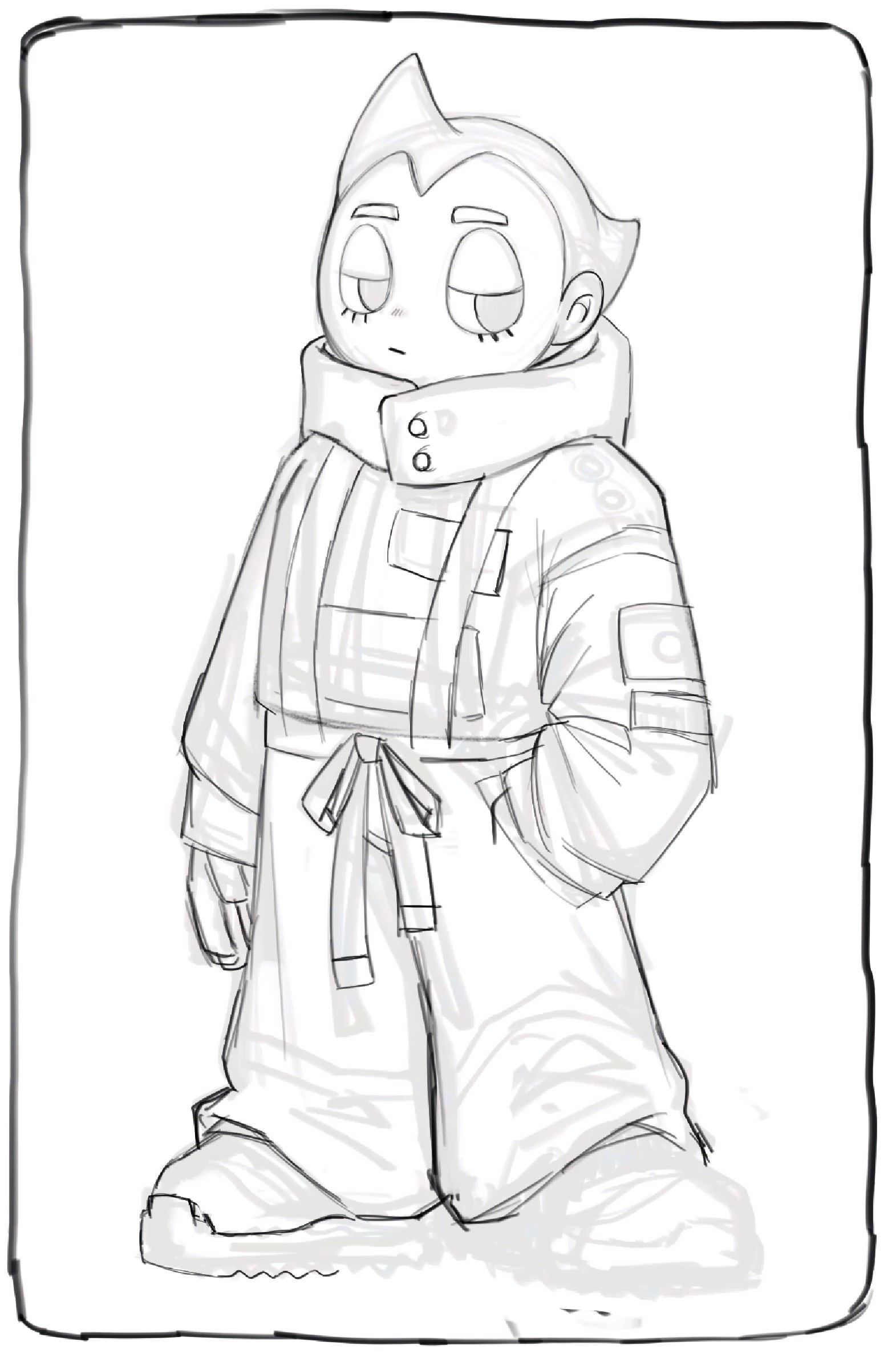
Mapping Out the Shadows
Once I'm confident with the final linework, I begin to map out the shadow shapes. I first choose a light source and direction. For this one, I decided to light it from the top right. Now I use my understanding of how light and shadow work to imagine and map out where the shadow shapes will be. I also try to indicate or anticipate where my form shadows vs. cast shadows will be at this stage, so I know which shapes will have a soft edge and which will have a hard edge. I typically use a color to map these shadows out to differentiate them from the linework. Because this drawing is from my imagination, I can also take some creative liberties with the shadow shape design. I try to make sure the shadow shapes are believable, but they don't have to be 100% accurate. As long as they're not too distracting and create a nicely designed shape, I'm good to go.
Once I have the shadow shapes roughly mapped in with my blue line, I have to fill in the shapes with a shadow value. Before I do this, I first need to cut out the entire silhouette of the character with the lasso tool. I fill in the silhouette shape with a light grey and then make a new clipping mask layer on top. On this new clipping mask layer, I can fill in the shadow shapes without having to worry about the grey spilling outside of the silhouette. Now with the lasso tool again, I trace over the shadow shapes I mapped in blue and fill them in with a darker grey tone. I love using the lasso tool for this step because it makes crisp, sharp shapes. Even though form shadows will eventually have a soft edge, keeping it sharp at this point lets me judge the shape design accurately and gives me more clarity on whether the shapes are working or not.
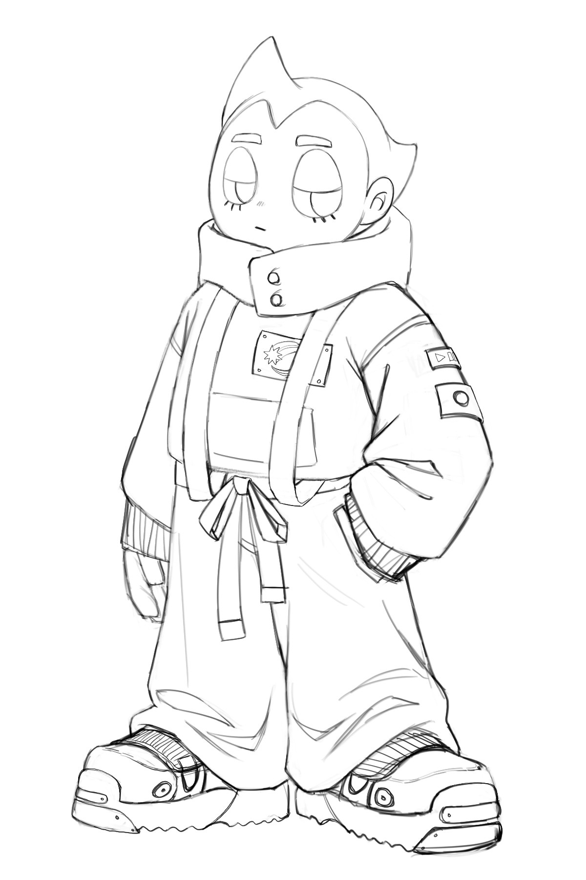
Adding Local Values & Bounce Light
Once I have the basic shadow shapes in, I add one or two darker tones to areas that have a darker local value. For this drawing I wanted the hair, pupils, and some accents in the clothing to be darker. This step always makes the drawing come together and feel a lot more finished.
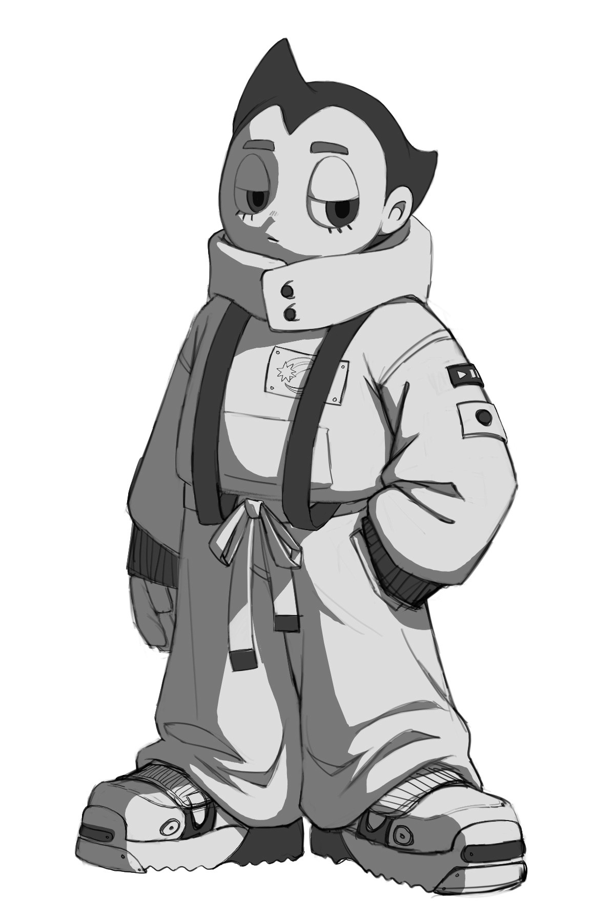
I decided I want a subtle bounce light on the shadow side to make the form turn a little bit more over the edge, so I added a subtle light shape on the left edge. To do this, I added a new clipping mask layer over the shadow layer, set it to an overlay adjustment layer, and carved out the desired shape with a brush.

Final Touches
I'm pretty happy with everything at this point and feel like I have all the information I need to get started on the final traditional drawing. I was really happy with this digital mock-up, so I just knocked in some fun little highlights to indicate where I can add those in the final drawing. The highlights really make the piece feel finished even within this rough mock-up.
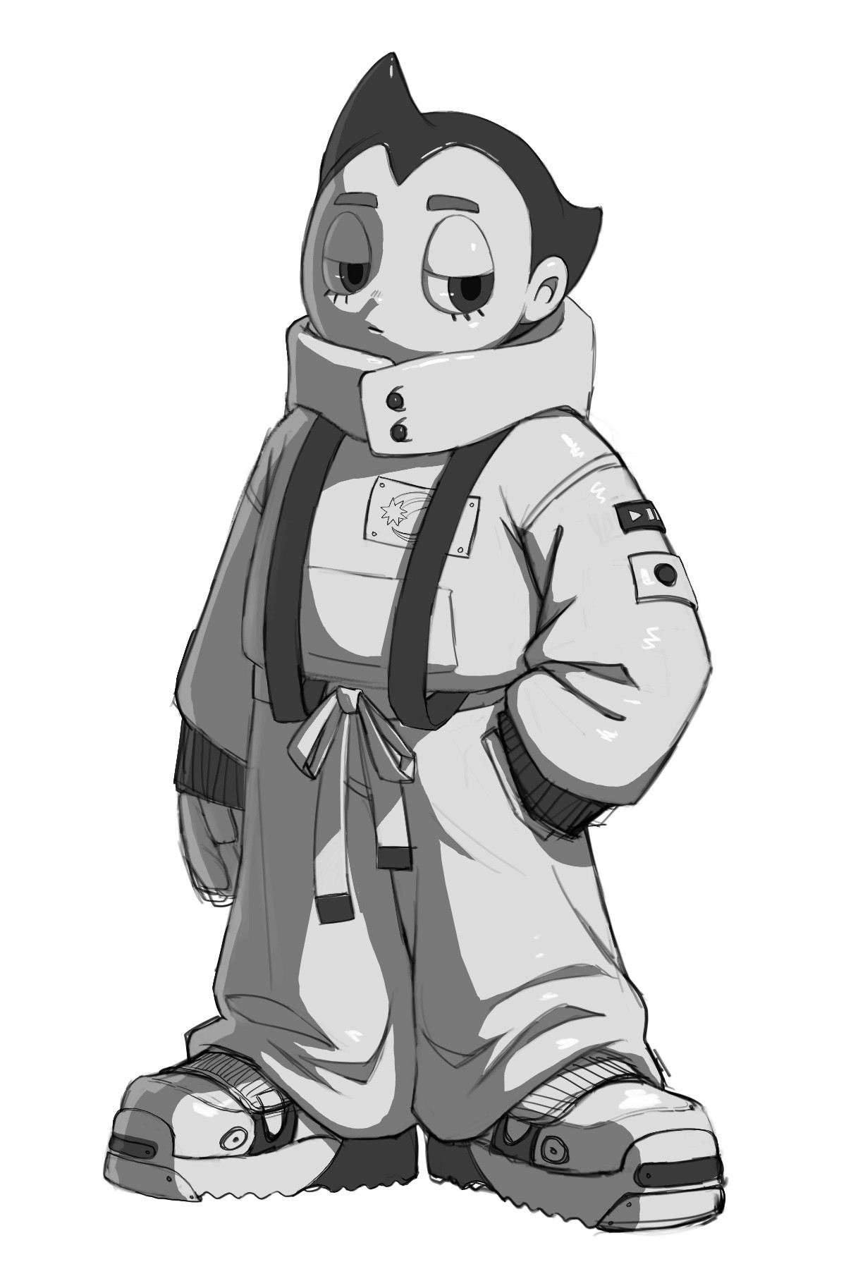
For my last step, I did some designs for the background of the character so I know what I want to do with the background in the final piece. I decided to do some lettering in Japanese and English for Astroboy's name: Atom. I'll probably paint this with acryla-gouache in the traditional piece. As a final touch, I like to add a little bit of gaussian blur to a duplicated shadow layer to see how a soft edge would look. I'm really excited to get started on this drawing with pencils next!
And that wraps up how I create digital mock-ups for traditional pieces in Procreate! The goal of these mock-ups is to figure out as much of the logistics as I can before starting on the final traditional piece, so I don't hit as many roadblocks during the final process. Working traditionally is much less forgiving than digital, so planning ahead really helps!
In the next article, I'll share how I use this digital mock up to help me create the final traditional piece.