Nov 14, 2025
Bridging the Digital and Traditional: My Drawing Method Explained
How I transform a digital sketch into a fully rendered traditional piece.

Hey everyone!
Welcome to the second part of this tutorial for my Astroboy piece. In part one, I went over how I create a digital sketch to inform my traditional work. In this article, I'll walk you through step by step on how I use that digital sketch to create my final traditional piece.
The Transfer
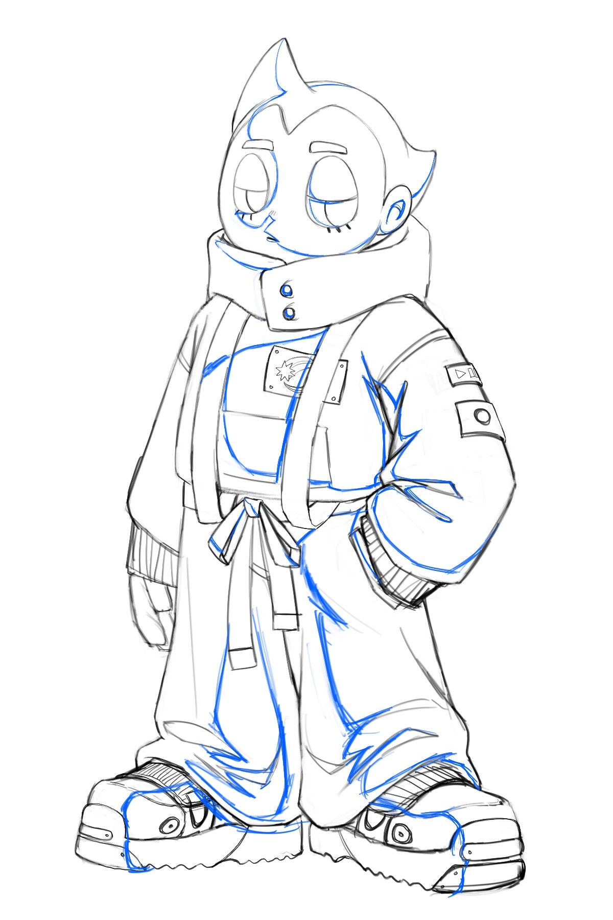
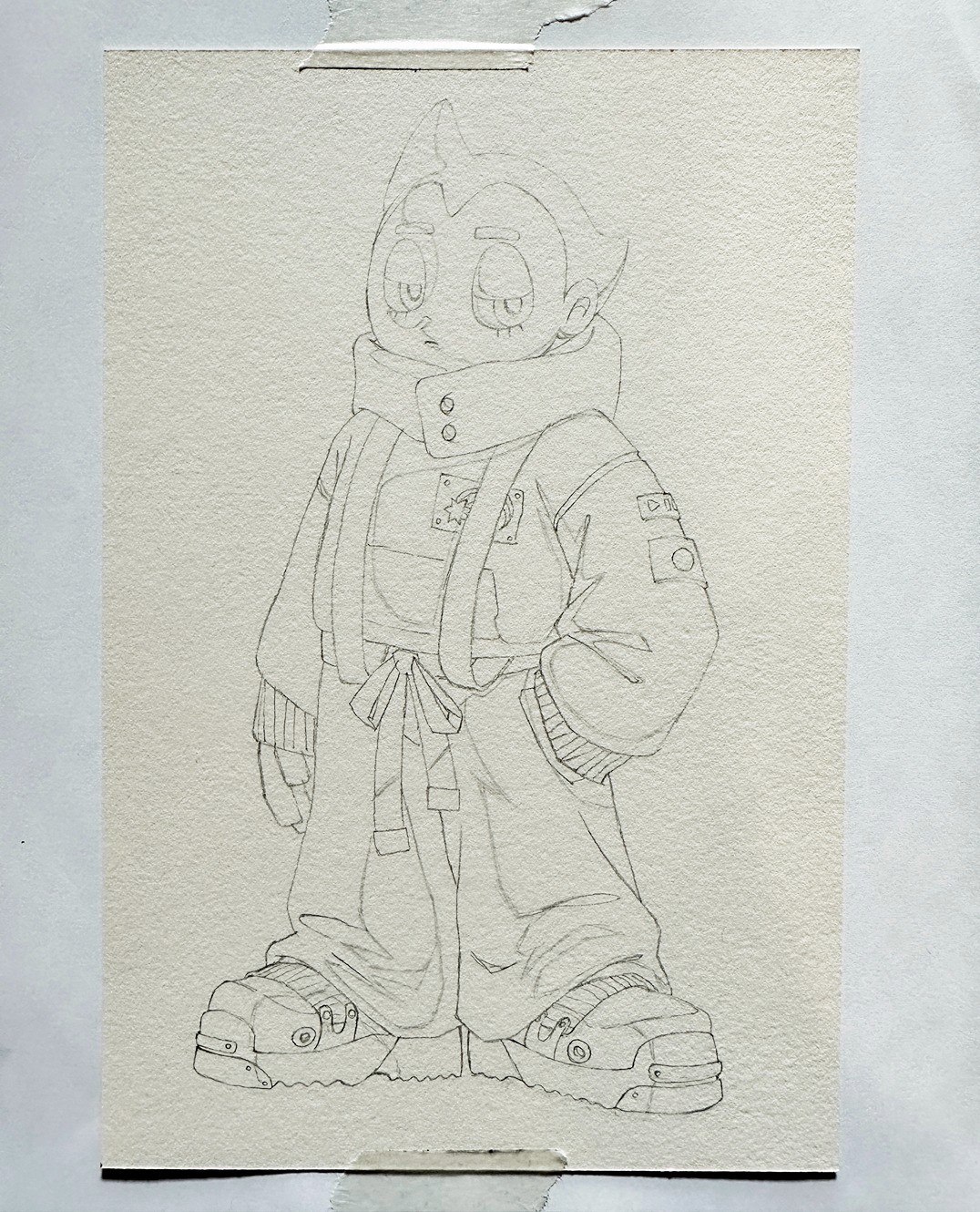
In the previous article, I took my digital sketch all the way to a lighting mock-up stage, but I don't need all of that information for transferring my drawing to physical paper. So I turn off all the value layers to leave just the linework. I also keep the initial lighting block-in lines so I know where my shadow shapes are. Then I print out this line drawing at the scale I want my final drawing to be. Below is the drawing I would print out:
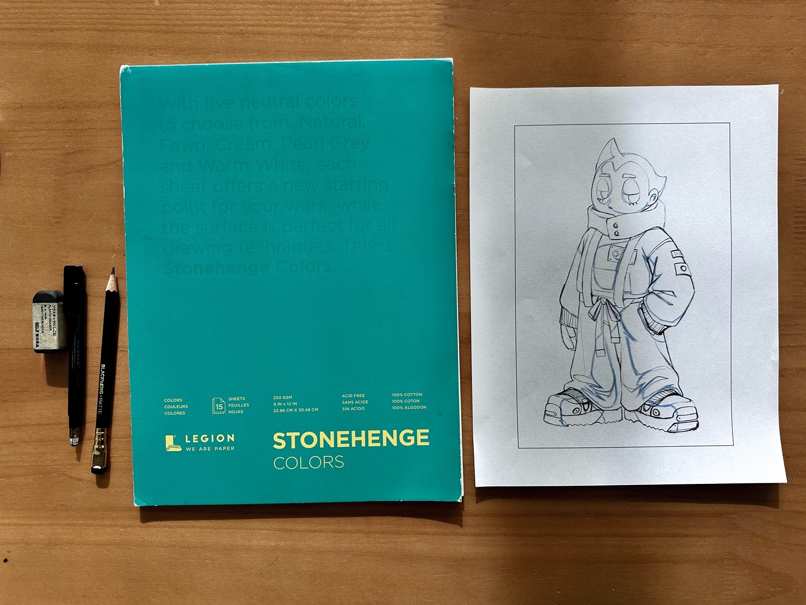
I'll be using 250 GSM Stonehenge paper for this drawing. Stonehenge is a very high quality paper brand and they have a variety of available paper textures, colors, and sizes. This paper can be used for a lot of different both wet and dry mediums. It can be a little soft for highly rendered pencil drawings so it's sometimes a little difficult to work with in graphite. I used this paper for this piece since it was something I had wanted to try, but if I could go back and redo the piece, I would recommend using a sturdier paper like Arches cold press watercolor paper 😅.
Transferring the Drawing
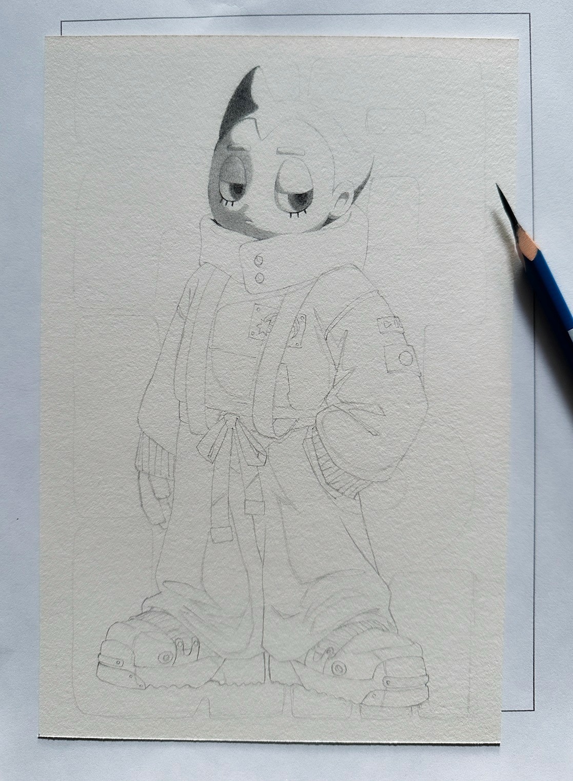
First, I'll cut my Stonehenge paper to the exact size I want and then pull out my light table. I have this really amazing light table from LitEnergy that I've been using for over 7 years and it's still going strong. It's under $20 and such a great tool if you work traditionally. I'll place my printout underneath my final Stonehenge paper and line it up to where I want it. Then I'll lightly tape it down with acid-free tape so it won't move while I'm transferring the drawing. Now the drawing is ready to be transferred!
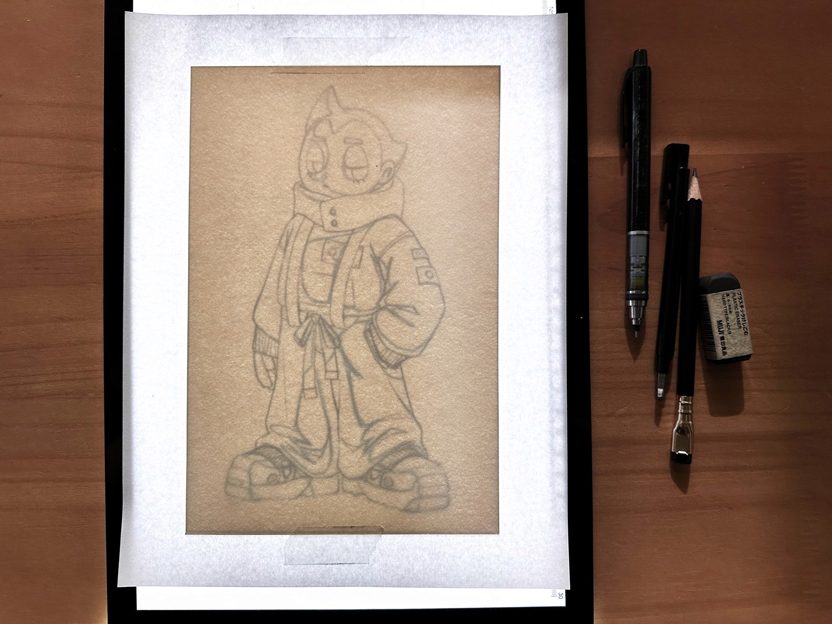
I typically use a 0.3 mechanical pencil with B lead to transfer my drawings. This lets me keep the lines extremely precise and thin, and I draw with a very light touch so I can completely erase the lines later if needed. I'll draw all of the linework first, and then go back in with an even lighter touch to draw the shadow shapes so I can distinguish between the two types of lines.
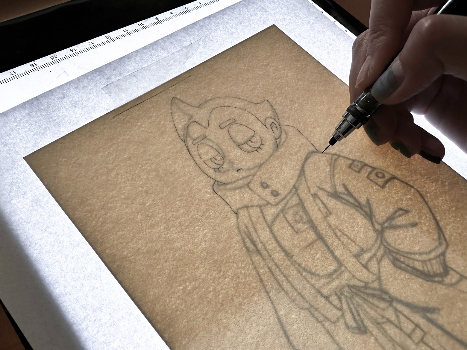
And this is what the linework transfer looks like once it's all done!
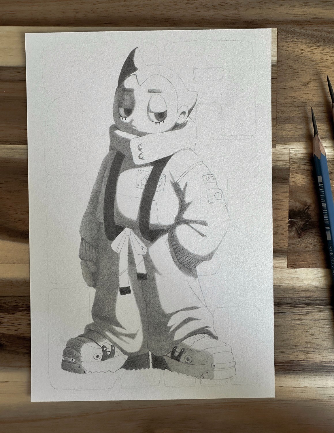
Filling in the Darks
The next step is to fill in all of the dark areas of the drawing. I typically start by filling in the shadow value and the darker local values. This helps me establish the darkest range of my drawing, which will inform how my gradients will look once I start rendering. Flattening the shadows is the most time-consuming part of rendering a drawing because I need to fill in large areas with a smooth, dark, consistent tone. Especially with toothy or softer papers like Stonehenge, it's particularly time-consuming and sometimes challenging to achieve a consistent tone. I was struggling a lot with getting an even shadow tone, and not gonna lie, there were points where I started regretting my paper choice 💀.
I typically use HB, 2H, and 4H lead pencils sharpened to a razor-sharp point to flatten the shadows. The HB will get you the darkness, and the two harder pencils will help fill in all the tiny holes in the paper to achieve a smooth tone. For the darker local values, I used a 2B on top of the other three leads to achieve the darkness, but I still need the harder leads to fill in the small nooks and crannies in the paper.
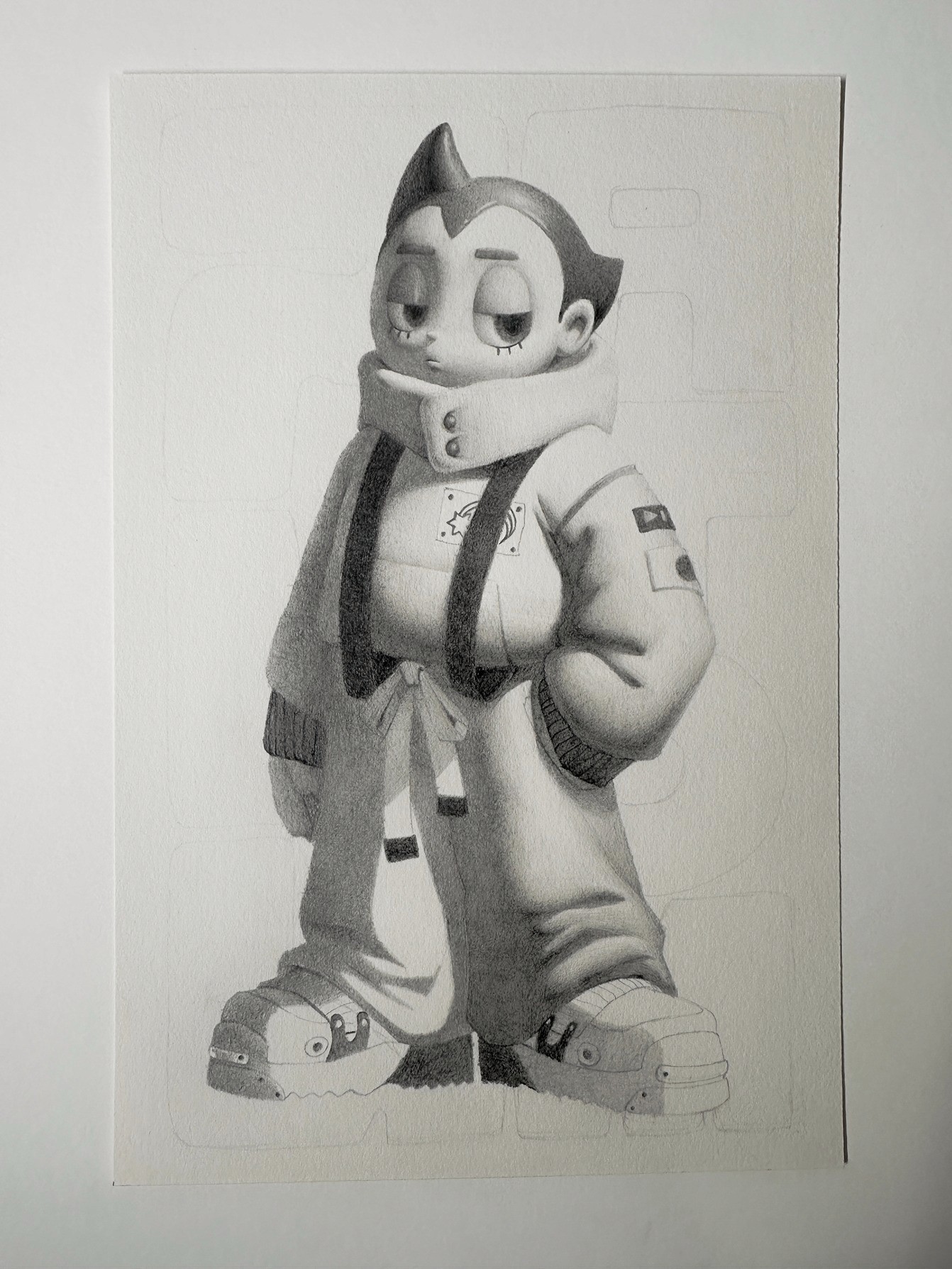
After hours and hours of filling in the shadows, you get something like this:
Rendering
Once the shadows are done, you are ready to start rendering! I started off with the face because I wanted the tightest rendering in this area. I will use harder leads like 2H, 4H, and 6H for the rendering. I will start off from the shadow side and slowly build up my pencil markings until I get a gradient going from dark towards the light. Light fall off is exponential, meaning the transition from light to dark is extremely fast so most of my value transitions will happen in a very tight area right around my terminator. So I usually spend most of my rendering time finessing the gradient around the terminator. (Learn more about how light works in my Light & Shadow Crash Course Video!) Once I'm out of that thin gradient band, I will use my lightest 6H lead to lightly shade the brighter areas, sometimes barely scratching the surface of the paper as I move towards the lightest point.
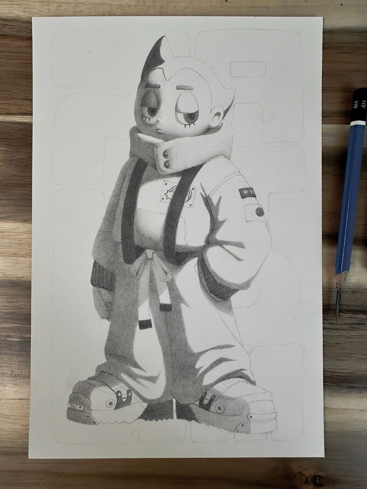
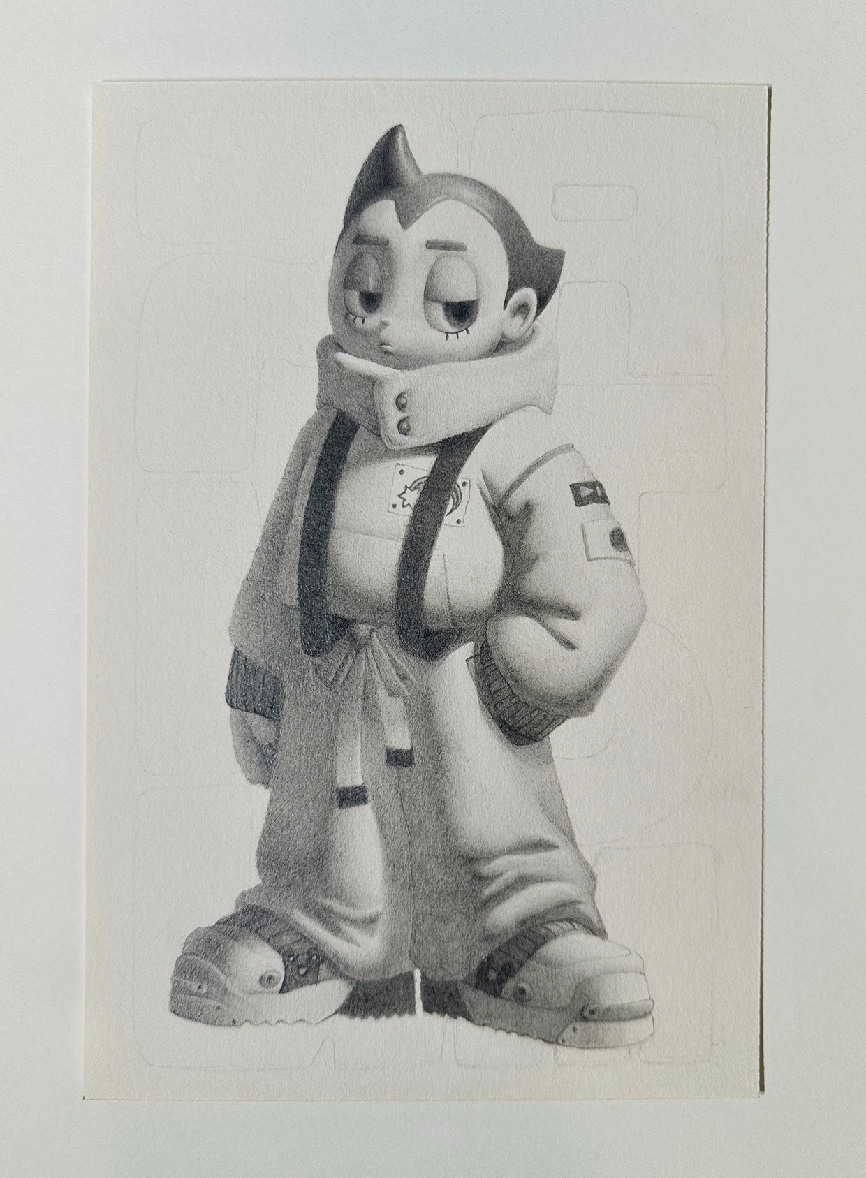
In the areas with a darker local value like the hair, I render in the exact same way, but the light areas will be darker than the face. I'll still achieve a gradient from the shadow to the light, but it will all generally be a darker shade. I'll also start adding some highlights with a sharp eraser to add that finished sparkle.
I'll continue to render in the same way, section by section, all the way down the body. I usually have my digital sketch open in front of me as a reference to remind me of the lighting structure while I'm working. It's really easy to lose sight of the big picture at this stage because you're so focused on small sections and can get tunnel vision. Always remember to step back, zoom out, and make sure your picture is working as a whole.
Final Touches
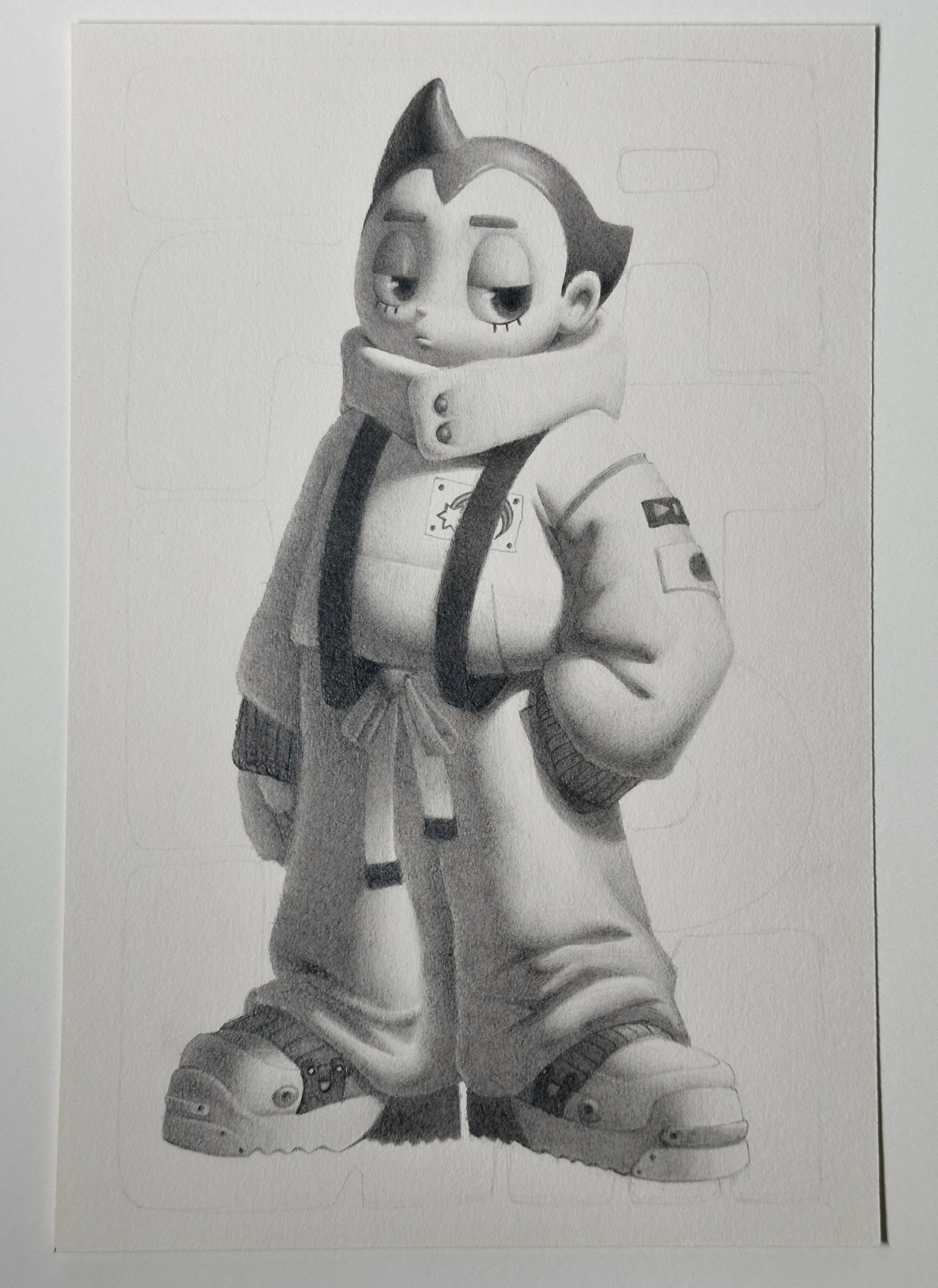
Once I'm pretty happy with the overall rendering and how the image is looking, I'll continue working around the image, tightening areas I want to refine, adding some darker accents where there are occlusion shadows, and adding some very subtle bounce light to appropriate areas. And of course, I'll go in with some highlights at the end to light up the eyes.
The Background
I wanted to play with the contrast between flat shapes and a form-focused drawing, so I decided to paint some slightly abstracted text for the background with acrylic paint. I think the contrast came out really nicely, and the paint texture is also a fun touch! After that, I signed it at the bottom and this piece is complete!
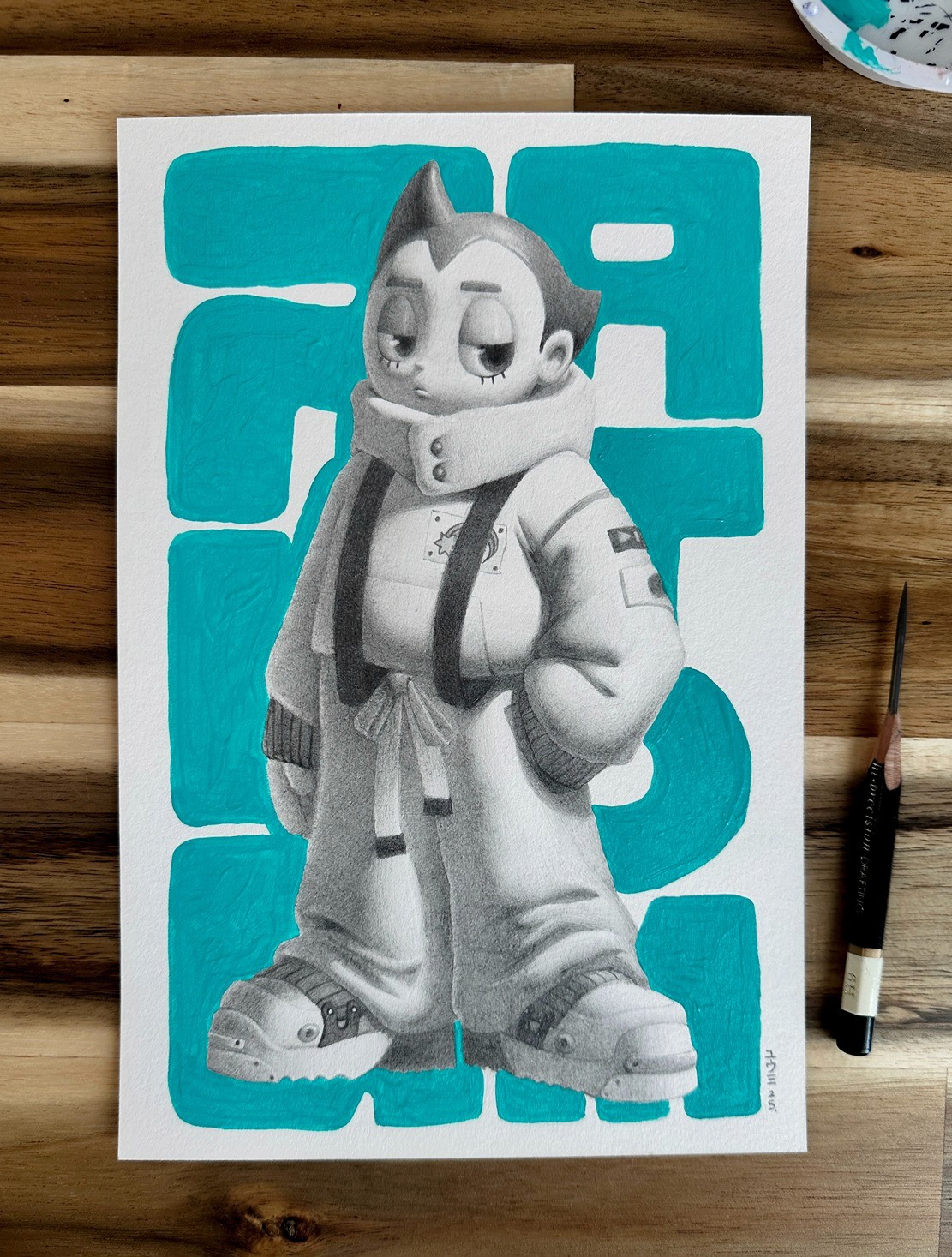
This piece is headed to Designer Con in Las Vegas, an annual convention showcasing collectible toys, plush, customs, designer apparel, and urban and underground art. It's such a fun convention and one of my favorites to attend!
Final Thoughts
And that wraps up my full process tutorial for making a traditional piece! I tend to follow a very systematic approach to making art, which helps me keep my process organized and efficient, especially when I'm working on a deadline. Of course, every piece is different, but it's extremely helpful for me to have this structure to fall back on in case any issues arise. I hope that having this insight into my process can inform and improve your own workflow for both traditional and digital pieces!